
Users tend to judge apps based on their icon designs. A well-designed app icon serves as an indicator of high quality and helps to convey the message of professionalism. The first impression matters and your app logo needs to be appealing and transparent enough for the potential user to reach for it and download it. Even though it may seem easy and straightforward, there are some tricks behind app icon design that we want you to know.
Icon Design Requirements
Before crafting your app icon design, there are some requirements set by Google or Apple every icon has to meet. Both provide detailed descriptions of what principles every app icon must follow. Make sure you follow not only technical recommendations but also stylistic ones. It is important for app submission and further optimization on App Store and Google Play Store.
Apple App Store Requirements
Each app needs to have two icons of different sizes – the small one for the home screen, and the big one for the App Store.
Apple devices vary in the icon sizes. Here is the preview of the required icon sizes for each Apple device.
| Device | Icon Size |
| iPhone | 180px x 180px (60pt x 60pt @3x) 120px x 120px (60pt x 60pt @2x) |
| iPad Pro | 167px x 167px (83.5pt x 83.5pt @x2) |
| iPad, iPad mini | 152px x 152px (76pt x 76pt @x2) |
| App Store | 1024px x 1024px (1024pt x 1024pt @1x) |
Besides the size, all icons must adhere to the following specifications.
| Attribute | Value |
| Format | PNG |
| Colour Space | sRGB or P3 (see Colour Management) |
| Layers | flattened with no transparency |
| Resolution | Varies (see Image and Size Resolution) |
| Shape | Square with no rounded corners |
Google Play Requirements
When creating your artwork, pay close attention to the following specifications:
- 32-bit PNG (with alpha)
- Dimensions: 512 px x 512px
- Maximum file size: 1024 KB
- Shape: Full Square
- Shadow: None
As Google Play dynamically renders rounded corners and drops shadows for your app icons, you should omit them from your original assets.
After the asset is uploaded, Google Play dynamically applies the rounded mask and shadow to ensure consistency across all app/game icons.
APK launcher icons are somewhat different from the Google Play icons, so if you want to dive deeper into the matter visit Android Adaptive Icons and Product Icons where you can learn more about the guidelines and the principles of icon design.
Tips for Icon App Design
It is true that content is much more important than the cover or the package. In general, that rule still holds, but when we’re discussing mobile app design and app icons, that is where it fails massively.
The research shows that 92.6 percent of people decide whether to download or buy the app based on visual factors. The aesthetic of mobile UI has become extremely important. It would be a waste not to get deserving downloads because of the unfitting icon.
Follow the best practices and icon design tips we provided and the chances people will notice your app will significantly rise.
1. Do the research on your app icon design
To design app icons, see what is out there for several reasons. First, be sure that your idea is universally recognizable and appropriate. That means that you need to create a logo or icon that will not offend or upset anyone who sees it. Research the cultural differences and see if the symbols you plan on using have any negative connotations within the broader audience.
2. Check out the competitors apps icons
If you are creative to come up with something we haven’t seen before, that is amazing! Now, looking at it objectively, it is hard to be so original and chances are, an app similar to yours already exists. Don’t forget to observe what their logos look like.
Pay attention to color schemes, symbols, and the overall design. A detailed competitive analysis can help you figure out the ways to stand out among your competitors.
Also, don’t be afraid to seek inspiration on design sites like Dribbble or Pinterest. Comparing and getting app icon inspiration from your competitors is not forbidden, but do not copy. That might hurt your app’s credibility.
3. Want a bold app logo design, go for it!
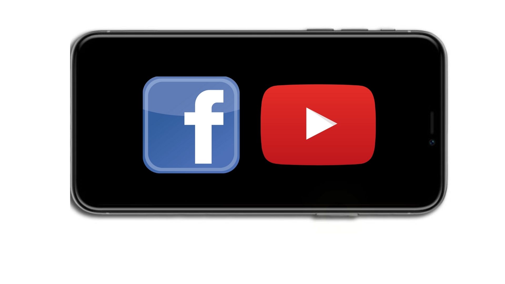
We do not suggest putting a bunch of colors and symbols in your app, just the opposite! Be brave and go for the simple app icon design. Lots of successful apps have really simple logos, like Facebook or Youtube. Follow the guidelines and decide what is truly important for your app before picking colors and everything else. Have a clear vision of what you want to do and then implement the rest of the logo-making tips to create a logo for your app.
4. Illustrate your app’s function
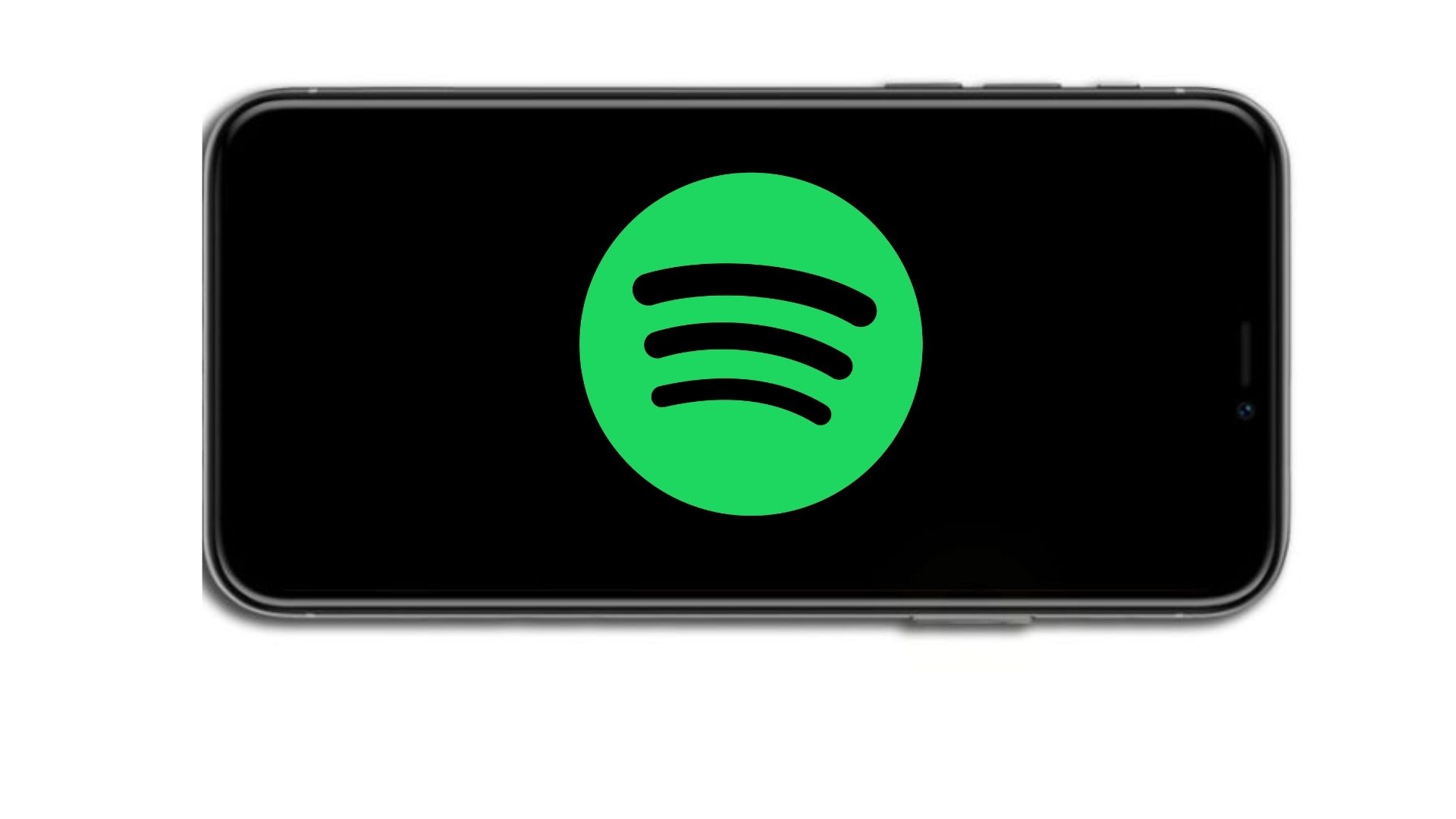
Not only does your icon design need to be visually attractive, but it should also reflect your app’s function. If you can make it transparent what your app is about just through the icon design, that will help you a lot. Potential users will get an idea about your app and will not question its purpose. Take Spotify as an example. They created a very simple logo. As Spotify is a music listening app, lines in the middle represent emitting radio waves. It is simple, visually appealing, and serves its purpose.
5. Avoid using photos in your app icon design
There is a tendency to avoid using photos as icons for your apps. Do you have a photo you want to translate into your app icon? There is a solution to that! You can create a vector image version of it. A great example of that is Sipp who used a literal photo as an inspiration for their app icon design. The final product looks professional and of high quality.
6. Don’t overload the icon
As we stated several times already, less is more. Do not overload the icon with multiple colors, symbols, or text. Remember that your icon will appear as a small square or circle on the user’s device. If the whole icon is not clearly visible, that might produce the counter effect. Be smart when choosing colors and symbols as that plays a marginal role in your overall app icon aesthetics. Let’s focus on that for a moment.
7. Use text sparingly
As your icon is small on the screen, adding any text within the icon design makes little sense. Users will not be able to read it and the idea of the icon is to depict what the app is about without the text. What you can, and should do is write a good app description where you can point out the most important features of your app. Such a description will draw people in after they notice your app icon first. Use that text to complement the app icon and present it in the best way possible.
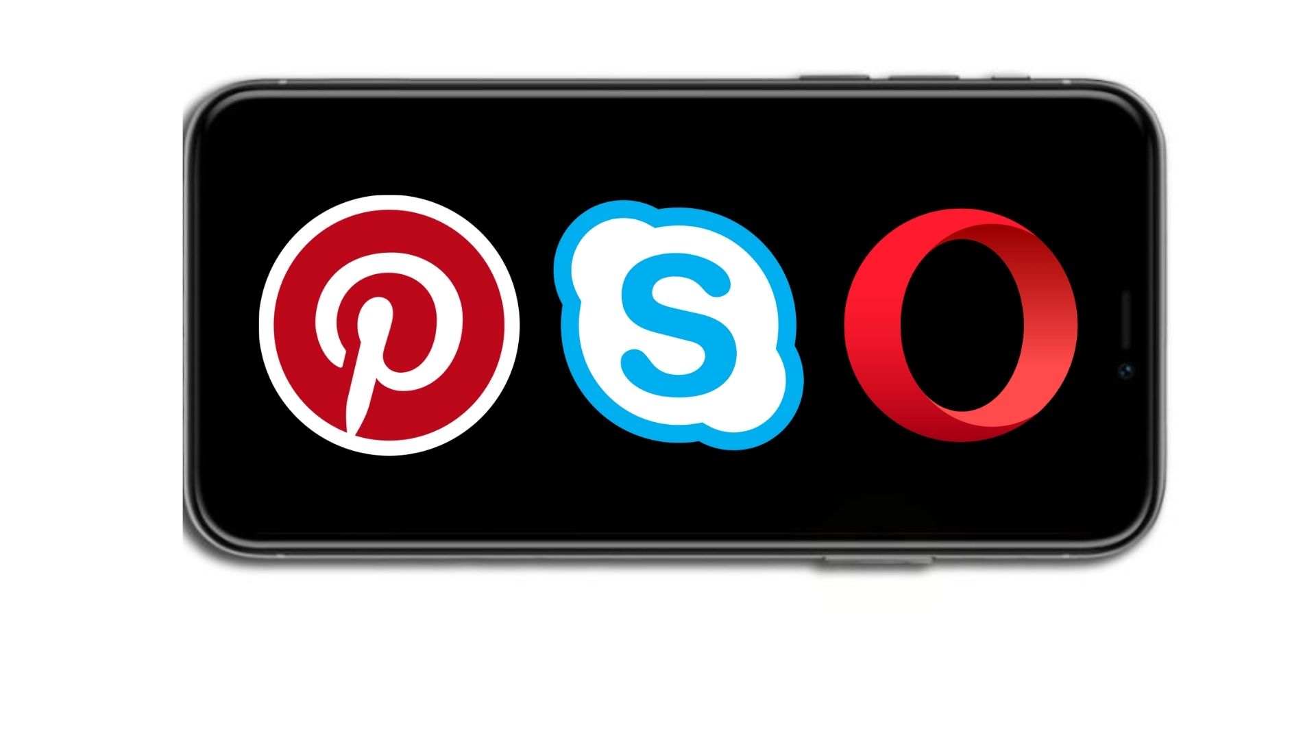
8. Think about using an initial letter as your symbol
Setting a stylized typography symbol as your app icon carries a dose of risk. Some top-tier apps feature an initial letter within their icon, for example, Pinterest, Skype, and Opera. If your brand or logo is a symbol element, it can be the main feature of your app icon. Be mindful of the colors you’re using, that is also important. Let’s explore the next logo-making tip – usage of colors.
9. Find your app icon design colour scheme
Picking your color scheme might sound like a challenge, and it truly is one of the toughest choices one has to make when creating an app logo. There are several points we would like to address, but first, take a look at this color wheel diagram.
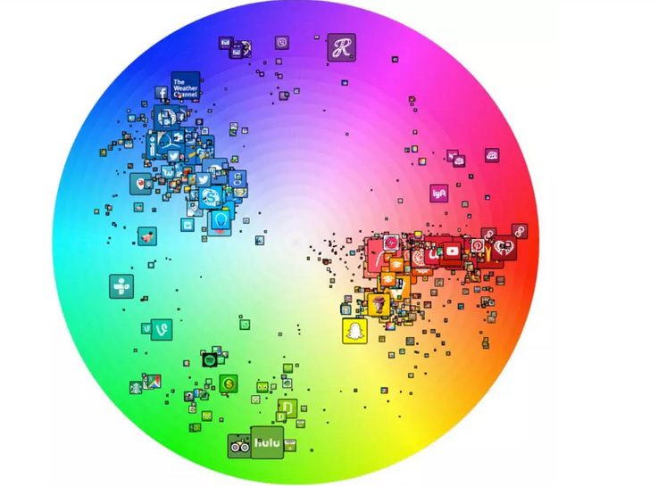
It is clear that three colors obviously dominate the app logo design. Certain colors carry messages within them. It is how we perceive colors and what meaning we give to them.
- Red symbolizes both good and bad states of mind and soul including love, confidence, passion, and anger. In design, the use of red color is an effective way to draw users’ attention.
- Green is often called the color of nature, balance, and harmony. Green brings calming and renewing feelings. Design in green colors perfectly suits the products connected with nature and finances.
- Blue is the color that reflects feelings of trustworthiness and reliability. However, as a cool color, it also associates with distance and sadness, so designers need to keep it in balance.
Limit yourself to two or three colors when designing icons and logos for your app. A neat design will draw even more attention than something “over the top”.
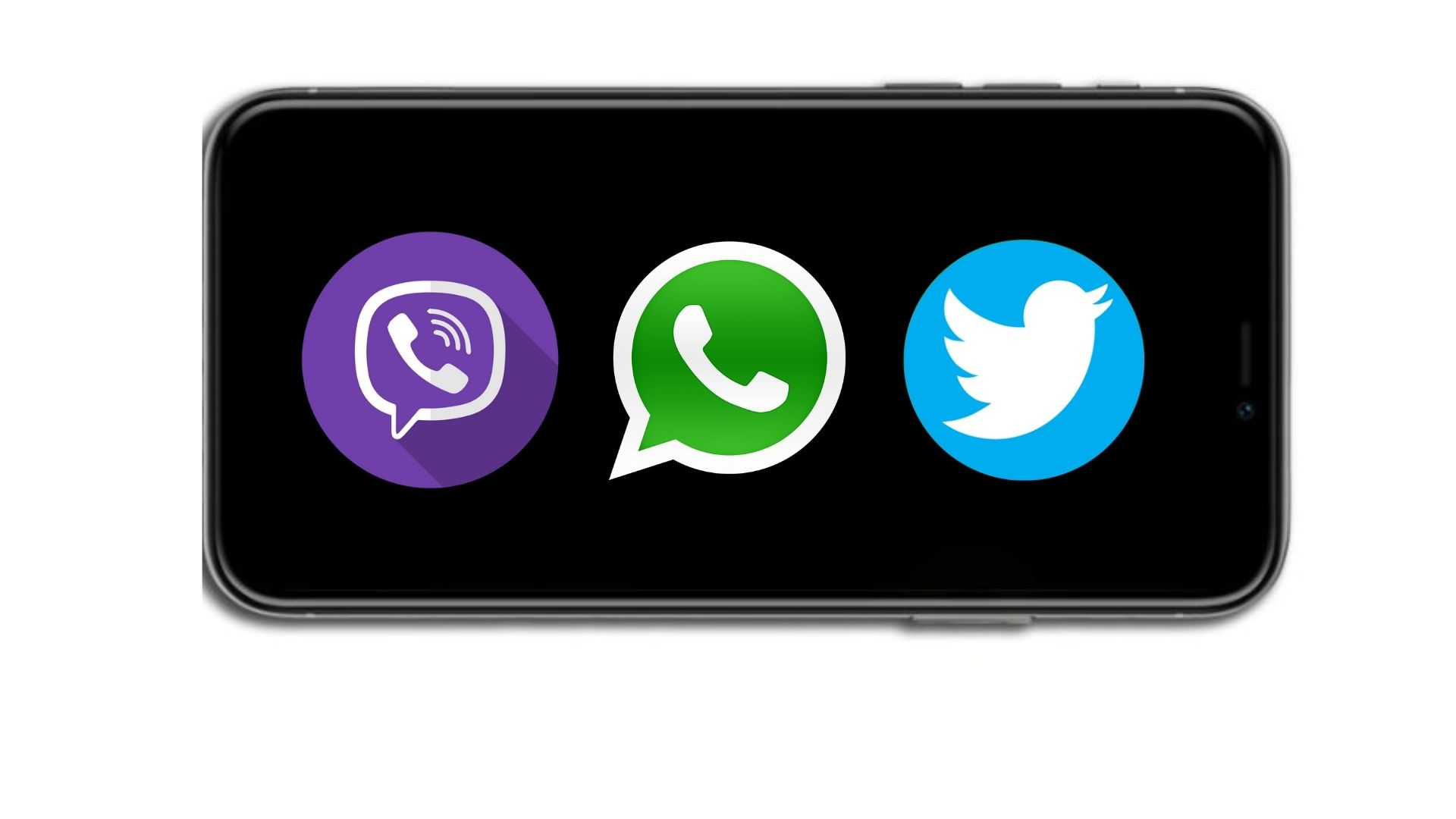
Many best-performing apps pick one basic color as the app icon background. Good examples are Viber, WhatsApp, and Twitter. All of them chose one color as the foundation of their design.
Furthermore, make sure your app reflects the qualities of your brand. Think of it as an ad in the App Store. You want users to notice your app. If you can incorporate the intention or some features of your brand in the logo, do it.
10. Logo borders emphasize the content
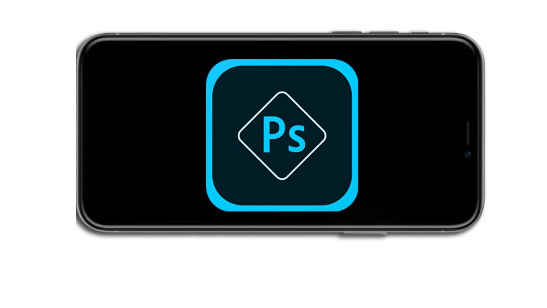
Think of using the border within your icon to emphasize the content inside. Moreover, borders add depth to your icon. Also, it elevates the aesthetic factor of the icon design. An example of such an app is Adobe Photoshop. They used the rectangle in which they situated the initial letters. Notice they used only shades of blue with black and white as their colors.
11. Avoid using transparent icons on iOS
When creating an iOS logo for your app avoid using transparent icons because the iOS 14 app design does not support it. If you do that, your app will appear to be floating on a black background. Using themes will also affect the colors and the original design of the app.
12. Test the app icon design
You have to see how your design behaves in different circumstances. Test your icon on various backgrounds and wallpapers. Does your app blend into the background? If yes, rethink your design. Also, try inserting your app icon in between random app icons, as well as competitor’s icons. If your app stands out in both situations, and if you implemented all of the above, you have succeeded.
Now you have a standout app icon design that looks professional and it will definitely get your app in focus among many others.
Best Free Tools to Create Logo Design
Supposing you want to try yourself out and test your icon design skills, you can do that in some of the following tools. All of them are user-friendly and straightforward to use. Here are our recommendations.
Canva
Canva is a simple video & graphic design tool. Possibilities within the app are almost limitless. You can create images, videos, postcards, logos, icons, social media posts, presentations, invitations… The list goes on. It has hundreds of templates, backgrounds, and shapes you can use for free, or you can upgrade for the premium account to gain access to additional features.
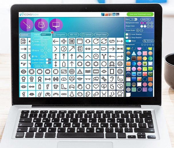
IconsFlow
IconsFlow is the right tool to start creating a high-quality icon set without any photoshop or illustrator skills. You can simply add all the icons you need and change the color of the elements, size, and shadow effects. One cool feature of this tool is the weekly release of new icon sets that are carefully crafted covering all sorts of styles. Your design will always look professional and fresh.
App Icon Maker
Another great free design tool is App Icon Maker – a cloud service that optimizes your app icon with proficient speed and generates icons of all sizes to be used on apps for different app stores. Its versatility serves designers and developers to resize icons for iOS, Android, and Watch apps. The icons are generated in various resolutions and you choose which one suits you the most. All you need to do is activate the download option and you’ll have the icons downloaded in a second.
Iconion
Iconion is a free icon maker software designed for the Windows and Mac operating systems. The app provides you with an extensive Icons Library from which you can easily download whichever icon you like for your product. If you are confident in your design and editing skills, try creating your own icon. Iconion provides lots of nifty features for you to use as you please.
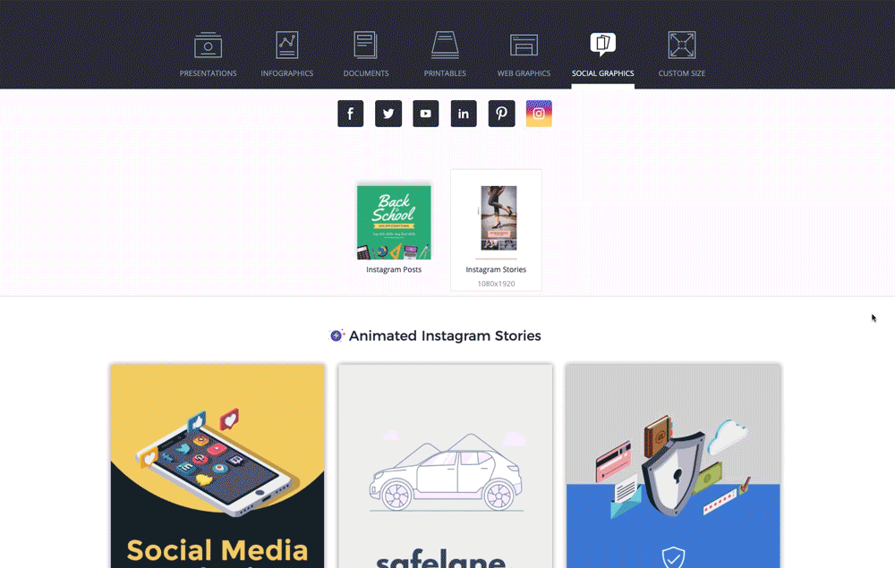
Visme
Visme uses the drag-and-drop editor that is intuitive, easy to use, and packed with features. You can easily create professional, yet attractive social media graphics, presentations, and infographics. Visme’s data visualization tools include more than 40 charts and graphs, customizable flowcharts, and an interactive map builder with plenty of customizable data widgets.
Design your App Icon with Shoutem
We understand that not everyone feels confident to start designing their app or app icon. It can be a challenging and time-consuming process for beginners. Additionally, surely some of you think you do not possess the skills to start on your own. That is why we are here, supporting your ideas from start to finish.
In our Shoutem Pro option, we can make an app from scratch inside our Shoutem mobile app builder. Don’t worry, we will also design an app icon for your future app following the best practices we discussed in this post.
If you want more information, book a free call with our experts to put that strategy on paper and start creating your app now.